A lot of expressiveness in your custom t-shirt design can come through having the right t shirt and ink color combinations. When creating a design for a team, business, or personal project, the colors that are ultimately chosen to be displayed are of immense importance. This will raise visibility, aided by bright and contrasting colors that will make your design pop and catch one's eye. But if colors are psychoactive and can create emotions, they can work in sending a message to the audience. Blue, for example, can represent professionalism and trust, and red can stand for excitement and vitality. Colorful use can give power only to the message. Besides this, well-chosen color combinations may differentiate your design from others in a way that will make it easily remembered and quite distinctive. Unique and imaginative color choices can make your design exceptional, and more attractive, and help it stay in memory.
In this blog, we will explore some of the best custom ink t shirt colors and give you some useful tips to choose the right ones based on your needs.
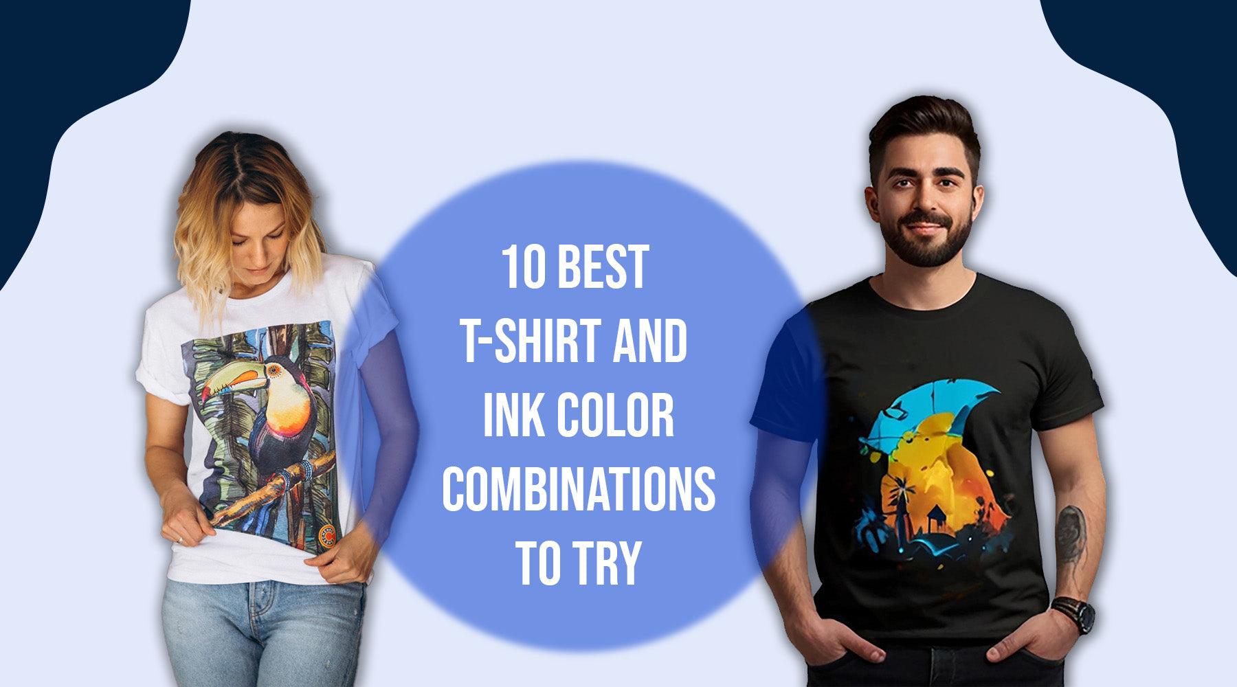
Popular T-Shirt and Ink Color Combinations
Here are some t-shirt and ink color combinations that have over time been tested and tried many times over, and continue to be a favorite combo for the production of beautiful custom t-shirts:
- Black T-shirt with White Ink: A classic and timeless ink and t-shirt color combo, this one carries off clear and bold designs very well. The contrast of colors makes your artwork or message really pop out. This combo works in any place and fits with any type of project either for formal or informal projects. It's one of those choices that people will opt for if they need impact and simplicity.
- Push to Black Tee with White Ink: It's a great color combination that gives great contrasting output. This is sure to be ideal for the type of design where one needs to use contrast to pop against a dark background. Great for nighttime events, or when you're aiming for that really modern, slick look. It would be impossible to ignore that white ink on black.
- Navy Blue T-shirt with Yellow Ink: Energetic and easily catches the eye, this combination is best for sports teams or football events. When mixed with the deep blue of the navy, this yellow ink will give a very salient contrast. This is an energetic and lively pairing, best for active and dynamic groups.
- Gray T-shirt with Red Ink: A very universal combination that suitably adopts formal and casual designs. The red ink comes out really well against the almost neutral base of the gray, which makes this very versatile combination one — perfect for just about any purpose. It is a perfect way to get the balance between being subtle and being loud.
- Red T-shirt with White Ink: This combination is bright and bold, which will work fine for promo and occasions where the team should easily be seen. The white ink really pops out with a sharp contrast on the red, making the design really noticeable. This makes the pairing extremely energetic and enthusiastic, perfect for catching attention.
- Green T-shirt with White Ink: Normally found in environmental causes or activities done in the open air, the mix is refreshing and cool. This white ink is a nice contrast to the green; it represents freshness and nature. The match is great for eco-friendliness and health-awareness projects.
- Light Blue T-shirt with Navy Ink: This low-key, high-impact effect is great for professionalism and projecting a superior image. The deep richness of navy ink sets off really well against the light blue background. It is a perfect combination for corporate events, business casual wear, or any event where a great and polished appearance is a must.
- Yellow Shirt - Black Ink: High visibility and high contrast give this combination the pop needed in industrial or safety applications, but also for retail venues. The black ink really gives a prominent statement over the bright yellow background. Practical and attention-grabbing for use when being seen is necessary.
- Maroon T-shirt with Gold Ink: This luxurious pair is only the best for special occasions or high-class branding. The rich maroon back is highlighted by the gold ink for an expensive look. Together, they ooze class and exclusivity, which makes it perfectly flawless for those high-end events.
- Rookie Purple/White Ink T-shirt: This tandem supplies you with an exciting and competent view, suitable for young events and creative work. The white ink is bright, which allows the purple color to really stand out in a multitude of designs. This combination is, therein, very fun and active.
How to Choose the Best Custom Ink T-Shirt Colors for Your Design
Choosing the best custom ink t shirt colors involves considering several factors:

Understand Your Audience
Consider who's going to wear your T-shirts. Color combinations will vary with the different demographics of your audience. Younger audiences might go for more vivid and bright; at the same time, the corporate audience would favor more somber, formal tones.
Also Read: Funny T-Shirt Sayings Worth Clicking on in 2024
Consider the Design's Purpose
However, the purpose of the T-shirt can be a big determinant. High-contrast combinations that scream for attention might work for promotional t-shirts but not necessarily when one is designing team uniforms, which call for colors that reflect team spirit and unity.
Test Your Combinations
Before finalizing your design, it is good to see how the ink color would look on the T-shirt. Most custom t-shirt printing services offer digital previews that let you know how your design would look on different colored t-shirts.
Ink Colors That Work Best on Dark T-Shirts
It can be a bit challenging to design on dark t-shirts, but the right t-shirt ink colors really make a design pop.
- White Ink: Very high contrast on dark T-shirts is obtained with white ink; clear. This becomes a go-to in such applications, working well when designs really need to be striking and obvious from a distance. Such a timeless blend ensures the design will be harmonious and clear to read.
- Metallic Inks: Metallic inks—such as gold and silver—are subtle yet refined dark t-shirts with a touch of class. They reflect light and give off an exciting, striking effect when viewed, thus perfectly useful for special events or upscale branding.
- Bright Colors: Colors like yellow, neon green, and bright pink also look quite nice on dark T-shirts. What this does is create a really good contrasting effect that has the view of a design stand out. Such bright colors go well with very playful, energetic designs and can attention-grab any second.
Also Read - How to Put a Logo on a T-Shirt: Easy Step-By-Step Guide
Guidelines for Matching T-Shirt Ink Colors with Fabric Colors
A perfect blend of creating harmony and contrast of t-shirt ink colors with the fabric color should be obtained. The following are some of the tips to enable you to achieve the best results in this venture:

- High Contrast: The color of the ink should be highly contrasted to the t-shirt material. The high-contrast combos will always turn out great, such as black ink on a white t-shirt or white ink on a navy t-shirt. They are some of the perfect combinations, and in these, your design will come out clear and with an impact.
- Complementary Colors: The use of complementary colors will bring out a design that is harmonious and pleasing to the eye. Complementary colors lie opposite to one another on the color wheel—for example, blue and orange, or green and red. Complementary colors bring energy, focus, and attention to your design.
- Feel the Fabric: The feel of a T-shirt can also impact the appearance of the ink on that T-shirt. Smooth fabrics provide bright, crisp colors, whereas textured fabrics may take some of the edge off the ink's appearance. Knowing the feel of the fabric can help one choose an appropriate ink color that will best appear on it.
- Color Wheels: But how does one select a combination of colors to go on a T-shirt and ink? A color wheel helps you decide which colors best complement or contrast with one another. One of the key tools in developing an effective and beautiful design is the color wheel.
The proper T shirt and ink color combinations are important for a custom T-shirt that really hits the spot. If you look at your audience, the purpose of the design, and the color harmony, you will make sure that your T-shirts come out excellent and communicate your message. Feel free to play around with the different custom ink T shirt colors, and be bold enough to trial your designs until you get the perfect combination.
Ready to bring your custom t-shirt design to life? Visit DTF NC for top-quality custom t-shirt printing services. Start designing today and create the perfect t-shirt for any occasion!
Explore our T shirts collections-
4th of July | Halloween | Juneteenth / BLM | LGBTQ | National Parks | Retro States
FAQs:
1- What are some popular t-shirt and ink color combinations?
Top selling matches are:
- White with Black Ink T-Shirt
- Black with White Ink T-Shirt
- Navy with Yellow Ink T-Shirt
- Gray with Red Ink T-Shirt
- Red with White Ink T-Shirt
- Green with White Ink T-Shirt
- Light Blue with Navy Ink T-Shirt
- Yellow with Black Ink T-Shirt
- Maroon with Gold Ink T-Shirt
- Purple with White Ink T-Shirt
2- How do I choose the best custom ink t-shirt colors for my design?
Consider factors such as:
- Audience preferences: Color choices will vary across different age groups and demographics.
- Design purpose: High-contrasting T-shirts are needed for promotion, while team uniforms call for cohesive color schemes.
- Testing Combinations: Digital Previews come in handy to have an idea of what your design will look like on different colored T-shirts.
3- What ink colors work best on dark t-shirts?
On the other side, some of the best ink colors for dark t-shirts include:
- White ink: High contrast and clear.
- Metallic inks: Gold or silver for class.
- Bright colors: yellow, neon green, or bright pink for good contrast.
4- Are there any guidelines for matching t-shirt ink colors with fabric colors?
Here are some guidelines:
- High contrast: Make sure the ink color contrasts with the t-shirt fabric.
- Color: Use complementary colors as much as possible to enhance beautification. These are colors lying directly opposite the color wheel.
- Think about fabric texture: Lustrous fabrics can provide a much more brilliant color than textured weaves, which might soften the ink's appearance.


1 comment
Jasa Konveksi Bandung
Your article is very inspiring with high-quality content. We are sure that you will find additional useful information on our website. Come on, visit us at Jasa Konveksi Bandung and we can collaborate with each other.
Warm Regard.